
the minimalist magnolia
web and mobile site
The Minimalist Magnolia is a small, modern, handcrafted-to-order jewelry business located off the central coast of California. Founded by Carissa Watchor in 2014, The Minimalist Magnolia aims to pass on handmade, meaningful creations to each and every customer.
the problem
Products are only being sold through The Minimalist Magnolia’s brick and mortar location. Customers have many alternatives for buying and browsing jewelry online and without an online presence, The Minimalist Magnolia cannot grow.
the goal
Design an in-house website that provides customers an intuitive online shopping experience for handcrafted, custom jewelry.
Business Value: We expect that Minimalist Magnolia will increase sales and website traffic by giving current customers a new shopping experience and reaching new customers that are interested in handcrafted, unique jewelry designs. We expect an increased revenue stream from new customer purchases for our products.

saskia lamb, weston jones, timmy mcloughlin, bradley bowman
UX design team
Responsible for conducting research, developing digital wireframes for web and mobile sites, and designing high-fidelity clickable prototypes.
research
Use Cases: Our team worked with The Minimalist Magnolia to determine the goals of the website by outlining 7 use cases. Each use cases describes the step by step process a user goes through to complete a particular goal. We identified the most important goals of the site as follows: creating an account, searching for an item, adding an item to the cart, writing a customer review, checking out, initiating a return, and a “contact us” feature. Below are the use cases.


PACT Analysis: This framework helps us design UX by understanding the environment in which our system will be used. PACT stands for people, activities, contexts, and technologies - all components that influence the user experience and design.
people
We must consider the physical, psychological, and social differences of our users to ensure that the design of our site is accessible, usable, useful, and enjoyable. Our website must use a combination of text, color, and graphics so that people with varying physical ability can navigate our site. We also want our navigation to be intuitive, regardless if you’re a novice or expert. Lastly, we want to use familiar signage on our site (such as the cart and search icon) so that it is recognizable from any background or culture.
contexts
In terms of physical context, The Minimalist Magnolia website will be accessed by users in their homes, so it is important to design a site that can run smoothly in home with both high-speed and low-speed internet. For social context, users will likely be using the website alone without any assistance so the interface must be simple and intuitive to navigate.
activities
The end goal of the user journey is to purchase jewelry. However, there are many smaller activities (e.g. creating an account, adding items to cart, checking out) within that journey that we must consider when designing our website. These tasks should be simple and intuitive for our user to complete. This means including features that allow users to easily edit or delete items in their cart or remembering the user’s account information.
technologies
Our design must accommodate both mobile and desktop devices so it is important to consider the complexity of our design. There should be a seamless transition between the web and mobile versions of our website.
personas


ux design
Digital Wireframes: The first step of the design was making mockups for each process outlined in our use cases into web and mobile formats.


Prototypes: During the development of our prototypes, we got to see how our design translated. Below are a few of our prototype pages and an explanation of our design decisions.
Homepage: For the home page, we wanted to maintain the design ethos of simplicity. Navigation is easily accessed and modified to maximize our screen, especially in the mobile version. We chose commonly recognized symbols for items like the menu icon, close icon, and the shopping cart icon so users can navigate efficiently.


Login page: This page also maintains simplicity with only the items that are needed: an email and password field. We also included the common hyperlink style for “Forgot Password” for recognizability.


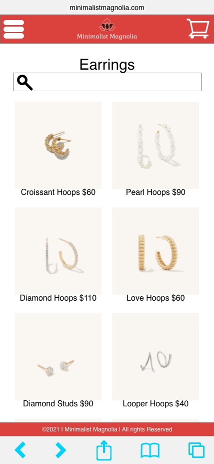
Products pages: We want the photos of the products to lead our user to navigate to their desired destination. Although the product photos, it is important to consider accessibility needs so each photo is accompanied with labels.


Item page: This page contains a lot of important design decisions: The carousel of images of the product evokes a sense of “window shopping” for items in real life. Drop-down widgets are used to help us contain a lot of information about personalization into a small area of the screen. Lastly, we used star icons to represent the product reviews.


Review pages: On this review screen, users can select how many stars out of 5 they choose to give the product and the stars fill accordingly. The review title and body are different sizes to establish hierarchy.


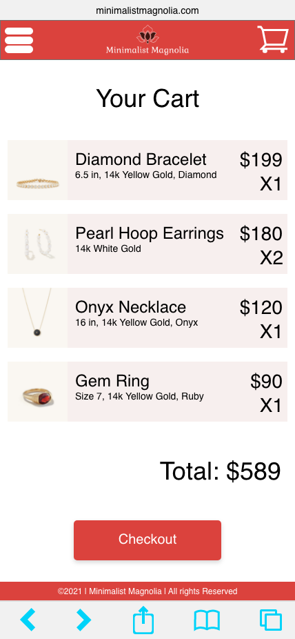
Checkout pages: The first checkout screen is the most basic overview of the user’s cart. This allows users to clearly see what they intend to purchase and give them the option to make any changes.

Account page: While this was not specifically included in our use case, we realized users would benefit from a central page where they could reach common destinations within the website.


High-fidelity prototype: For the final iteration of the Minimalist Magnolia website, each webpage was completed and interactions were added between each screen. Explore the clickable prototype below or here.