plant junkie app
Plant Junkie is a fictional food truck restaurant that serves plant-based fast food in the San Francisco area. Plant Junkie strives to serve a guilty-free alternative to traditional fast food by reinventing the burger, hot dog, and more. While tapping into “foodie” culture, Plant Junkie targets customers that are trying to make planet-conscious decisions to eat less meat.
the problem
Most people think that plant-based diets means only healthy, unappealing meals.
the goal
Design an app for Plant Junkie that allows users order delicious, plant-based fast food.
saskia lamb
UX designer & researcher
Responsible for conducting interviews, paper and digital wireframing, low- and high-fidelity prototyping, conducting usability studies, and iterating on designs.
user research: understanding the user
Target Audience: In the United States, more and more people are shifting towards a plant-based diet for a variety of reasons including environmental impact, health concerns, and treatment of animals. In fact, 22% of millennials have tried a vegetarian diet at some point. With this data, we can determine that our target audience is 25-40 year olds that are willing to eliminate or reduce meat from their diet.
Interview Findings:
stereotypes
There are misconceptions of the types of meals that can be plant-based.
tradition
Fast-food has primarily been beef-based burgers. Plant-based alternatives are new and a sign of change for some.
time
Fast-food is supposed to be fast and plant-based meals typically take more time to prep.
persona
koa
“One beef burger has the same impact as two months worth of showers”
Age: 23
Education: Bachelor’s Degree
Family: Eldest of 3
Occupation: Sales Representative
Goals:
Incorporate more plant-based meals into diet, especially when eating out
Try new types of foods in the “foodie” culture
Frustrations:
Doesn’t want to have to eat salad to eat healthy
Not many vegetarian/vegan options when eating out
ux design: starting the design process
Paper Wireframes: Drafting iterations of each screen of the app on paper ensured that the elements would be well-suited to address user pain points. The home screen only has one logical option to navigate through the app to keep the user’s journey simple.
Digital Wireframes: As the initial design phase continued, I made sure to base the designs on feedback and findings from user research.
The cart provides easy access to the checkout process. The order button takes users directly to the menu where they can start their journey.
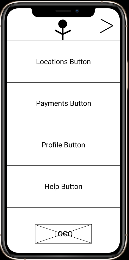
Easy navigation was a key user need to address in the designs so this menu tab allows users to access many screens from one location.
Low-fidelity prototype: The low-fidelity prototype connects the primary user flow of building their order and the actual ordering, so the prototype could be used in a usability study with users. View the interactive prototype here.
Usability Study Findings: After conducting an unmoderated usability study with the digital wireframes, we found 3 important concepts to include in the next iterations of the design.
efficiency
People want to order their food quickly
customization
People want more customization options
personalization
People want the app to personalize to their order preferences
redefining the design
Mockups: There were a few actionable insights I came up with from the usability study. One of these was adding an edit option within the add item process to allow users to customize more.
Before usability study
After usability study
The early designs had a pop-up when items were added to cart, but in the mockup items added to the cart are tallied by the cart icon (see top right).
Before usability study
After usability study
High-fidelity prototype: The high fidelity prototype followed the same build and order user flow as the lo-fi prototype, and included the design changes made after the usability study. View the prototype below or here.
going forward
Impact: The Plant Junkie app really allows users to explore a new side of plant-based food and makes ordering a yummy, healthy, meat-free as easy as possible. One quote from peer feedback: “Plant Junkie was extremely easy to use and it made me realize how many vegetarian options there can be.”
What I Learned: While designing the Plant Junkie app, I learned that the first ideas for the app are only the beginning of the process and there is a long road to go before you achieve your final iteration.
Next Steps:
1.
Conduct another round of usability studies to validate whether the pain points users experience have been effectively addressed.
2.
Conduct more user research to determine any new areas of interest.
3.
Add new features that make the app more customizable, personalized, and efficient.


